NextGen Brand Initiative
This iniative was a comprehensive rebrand designed to visually express the powerful partnership between NextGen and the nonprofits they serve. The initiative focused on building a cohesive identity that reflected collaboration, innovation, and shared purpose.
This modern, versatile logo system and a full suite of brand assets—including a comprehensive brand guide, graphics for social media, and templates for marketing materials—ensured consistency across every touchpoint. This new identity empowered NextGen to tell their story with clarity and confidence, supporting their mission
to help clients strengthen donor retention, achieve their goals, and create sustainable impact for years to come.

50x50 Brand Campaign
This branding initiative was created to help spark more opportunities for women in tech, with a big, hopeful goal:
reaching 50% female representation in the industry by 2050. The idea of “the spark” sits at the center of the brand —
a symbol of energy, curiosity, and forward motion that reflects both where we’re headed and the drive it’ll take to get there.
The project included a set of campaign logos, a clear and easy-to-use brand guide, and a collection of design
assets for the launch video, social content, and other communications.

Services & Initiatives Campaign
Two brand initiatives showcased Montage Marketing Group's data and language services. Collaborating closely with the marketing team, we aligned messaging and creative direction, incorporating custom graphic elements to distinguish each initiative while maintaining a cohesive narrative. This approach increased awareness and effectively highlighted the value
of these services. We leveraged social, and digital channels to broaden reach and strengthen brand recognition.


10 Year Anniversary Branding
This logo mark celebrated the agency’s 10-year anniversary, highlighting a decade of impact and partnership.
Building on the agency’s existing brand identity, the signature star—an iconic element of the primary logo—as the focal point. Paired with clean typography and a modern composition, the mark seamlessly integrates with the agency’s established visual language while standing out as a distinctive emblem of this milestone year.

Fairfax County 250 Commission RV Wrap
United by History. Enriched by Diversity.
This design was meant to tell a visual story that reflected the landscape of Fairfax County and the people who called it home. It wove together elements that highlighted the county’s resources, natural beauty, vibrant community life, and the rich diversity of its residents. Subtle details—such as excerpts from the Declaration of Independence, the U.S. flag, and the Fairfax County seal—were thoughtfully integrated to honor the county’s historical roots and national significance.
This design was created with flexibility in mind—it could be easily resized and adjusted as needed. My vision also included incorporating a brand tagline and an anniversary seal that could extend across additional signage and collateral for a cohesive visual identity.


Healthcare Enrollment Campaign
Two creative campaign concepts established to increase awareness and promote enrollment of hispanic seniors into the Medicare healthcare program.


National Park Service
The Spirit of Our America Proposal
As Art Director for The Spirit of Our America—an initiative proposed for the National Park Service—
I led the creation of a brand identity designed to bridge the rich history of America's national parks with their evolving relevance for younger generations. The visual system combined archival and contemporary imagery, layered with vibrant colors and bold, modern patterns that resonate with millennial and Gen Z audiences.
By blending familiar historical references with fresh, culturally recognizable aesthetics, the brand aimed to spark curiosity, foster creative connection, and inspire
a renewed interest in the parks and the stories
they preserve.


USDA Tradeshow Brand & Marketing
The “Yours to Explore” theme was developed for the USA Pavilion global trade show brand, in collaboration with the marketing communications team to ensure alignment with strategic goals. The project included the creation of a logo that honored U.S. agriculture’s heritage through color and graphic elements while conveying progress, diversity, and innovation through modern typography. A comprehensive brand and style guide was delivered, featuring a complementary color suite, identified textures, and adaptable patterns to ensure consistent and impactful application across a variety of mediums.


NIH All of Us Research Program
The All of Us Research Program was established in 2015 with $130 million in funding to advance
personalized medical care, with a particular focus on underserved and underrepresented communities.
The program traveled across the United States, collecting data from one million or more participants nationwide.
This initiative involved leading the design and conceptualization of digital, print, and in-person engagements aimed
at attracting participants and increasing enrollment. This included designing pop-up engagements and activities, storyboarding and overseeing video shoots about the program, and developing interior and exterior designs
for educational and traveling medical vehicles.


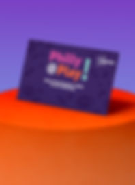
Philly @ Play!
This brand proposal was designed for an event in Philadelphia. The client sought a brand that was not only engaging but also resonated with stakeholders and donors. In conjunction with the marketing
and communications team, the tagline "Philly at Play!" was created as a play on words.
The use of bold, playful colors and patterns added vibrancy while maintaining a tone of sophistication.
This design approach reinforced the campaign’s central focus: inspiring donors to support the creation
of accessible play spaces in underserved communities.


Comcast Xfinity
This fully branded vehicle served as an interactive brand experience on wheels. The vehicle became
a dynamic hub where consumers could engage with new company products through hands-on demonstrations, digital displays, and product sampling.


Trak Vibes
This Amtrak proposal initiative aimed to attract and increase millennial ridership through unfiltered storytelling. Collaborating with the marketing communications team, we focused on authentic experiences, capturing the journey through real video clips and photos taken onboard to share across social media platforms. The campaign highlighted not only the trip itself but the destinations and experiences of travelers.
The use of outlined, heavy bold fonts introduced a dynamic and edgy aesthetic, adding a playful touch that resonated with the millennial audience, making the overall tone more engaging and approachable.

Peace Corps (HBCU Engagement)


The objective of this engagement was to develop a dynamic brand experience reflective of the Peace Corps' mission of promoting global service, cultural exchange, and community development. HBCU homecoming football game attendees were encouraged to explore volunteer opportunities and discover more about the Peace Corps' mission.
Creative Development
The proposed visual identity for this brand and engagement blended vibrant elements and authentic, high-impact imagery capturing real-life moments of Peace Corps volunteers and the communities they served. A vibrant and rich palette inspired by the cultural diversity of the communities served — earthy greens, deep blues, warm oranges, and bright yellows to signify growth, trust, and impact. Incorporating patterns and textures and symbols inspired by global cultures to create a cohesive and culturally resonant visual language.
Engagement
Interactive installations featuring volunteer stories, augmented reality experiences, game day inspired engagements, and informational materials. Customized takeaways (e.g., stickers, pins, and postcards) featuring key visuals and Peace Corps messaging.


Mi Parque, Mi Historia
This campaign aimed to increase visitation among Hispanic and Latino communities across all national parks. Launched across multiple social media platforms, the initiative featured the theme "Mi Parque, Mi Historia, My Park, My Story," encouraging visitors to share their park experiences and personal connections to these natural and cultural spaces.
A hand-script font style, cultural patterns, and National Park Service colors were
used to maintain brand alignment while resonating with the audience.
